1The last mile after dark
A speculative (but practical) story.
It is a little past eleven at night in Chennai. A 27-year-old software engineer steps off the train, tired, with 4% battery and no cab app that will open. The auto stand is a few hundred metres away and nobody there will quote a fare before she is in the seat. The lit route she would take in daytime is quiet now.
Nothing is broken here. The train ran on time and the app works. What fails is one assumption: that everyone arriving at a station is carrying a charged phone, mobile data and a payment method. At night, that gap is not an inconvenience. It is a safety question.


2The problem
Ride booking assumes a working phone. Transit stops don't guarantee one.
Chennai's metro and suburban rail stations move huge numbers of people, and many of them finish their journey by auto or cab. Booking that last leg depends on battery, signal, a payment method and a language the app speaks. Take any one away and a commuter is left to negotiate on the street.
This is worst for exactly the people the system should protect most: people travelling late, alone, or in a hurry, and those who are less comfortable with apps. A gap in a single moment of the journey becomes a gap in the whole trip.
How might someone book a safe, fairly priced ride from a transit stop in under a minute, without a phone, and still trust who is picking them up?
3What I asked and learned
I went in to learn how people really cope when the app isn't available.
Questions
- When is a phone not enough to get home: battery, signal, data, payment?
- How do people decide between an auto, a cab and a shared ride?
- What makes a stranger's vehicle feel safe enough to get into?
- What would someone actually do in 30 to 60 seconds at a public kiosk with a queue behind them?
Methods
Field observation at stations, short interviews with commuters and drivers, and a survey.
What I found
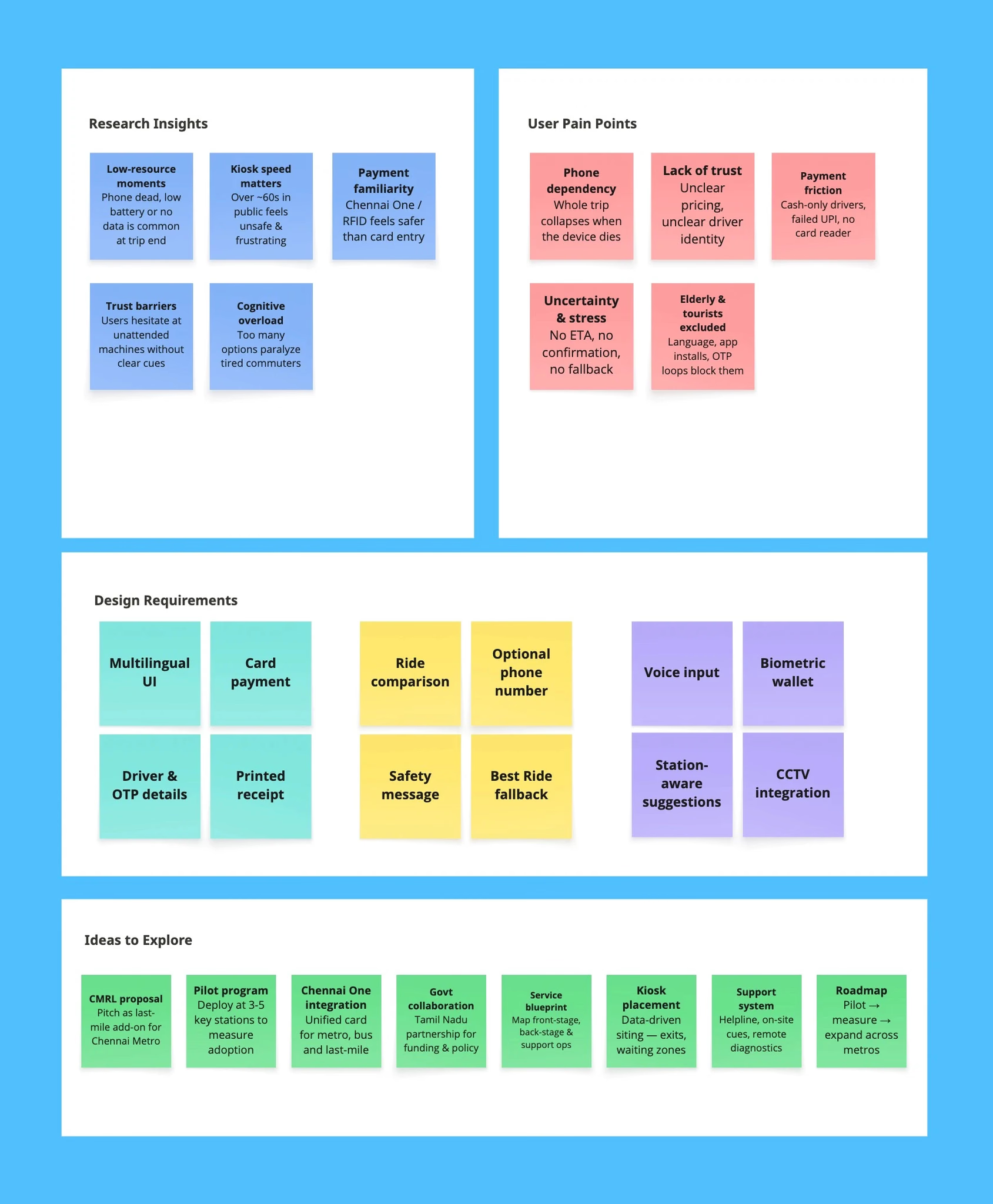
- Phone dependence is fragile. Battery, signal and payment each fail on their own, usually at the worst moment.
- Language is a barrier. Tamil and English both matter, and many people want to see the price before they commit.
- Trust is about verification. Passengers want to know the vehicle and driver are who they say they are, and want someone at home to know too.
- Cash is shrinking but not gone. People already carry a Chennai Metro card, which is a payment method they trust.
I stopped designing "a better ride app" and started designing for the moment the app is unavailable. That moved the product out of the phone and into the station.
4Who it's for
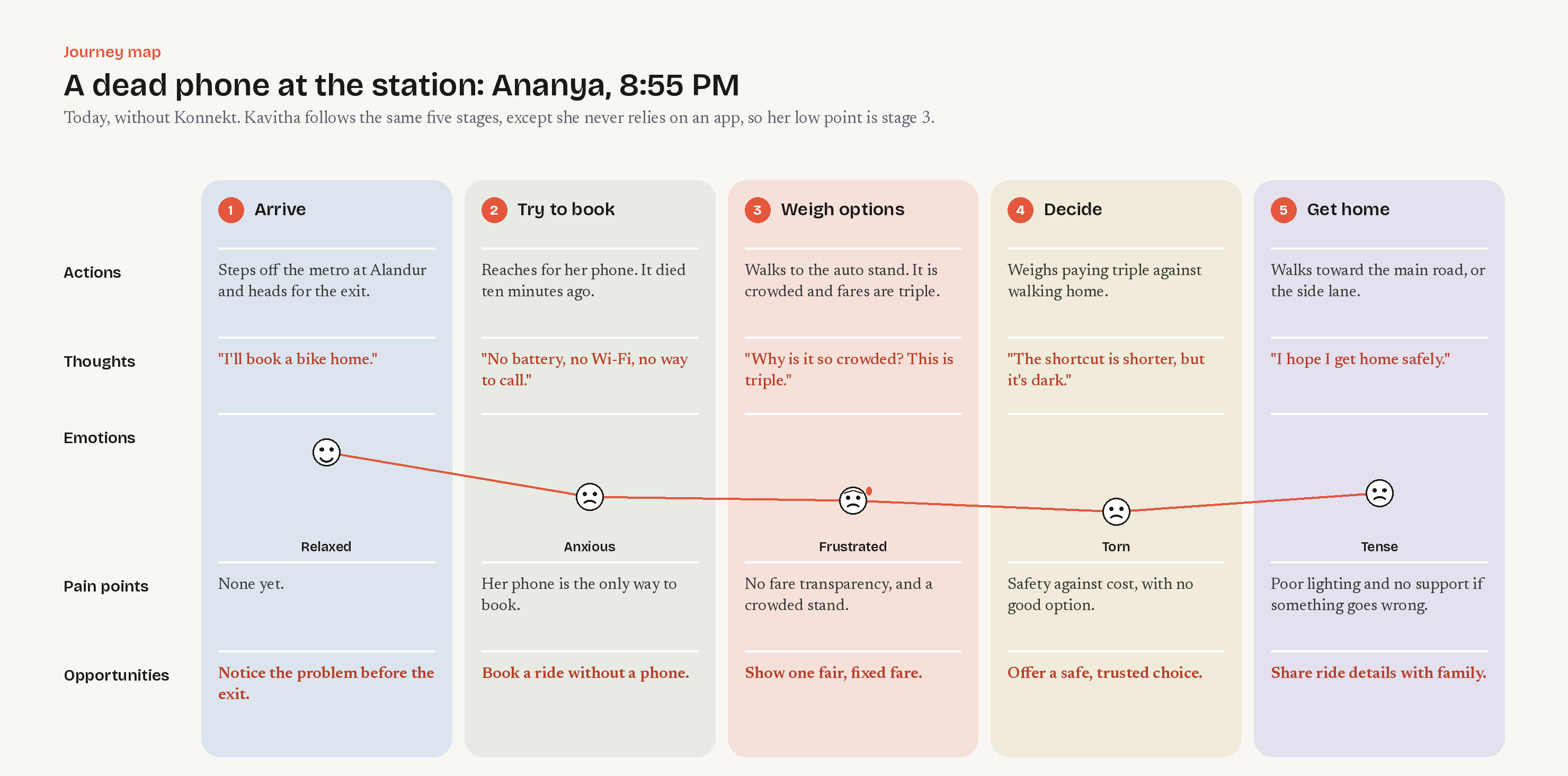
Two people, two reasons the phone fails them.

Mapping their journeys side by side showed the same four stages: Arrive, Decide, Pay, Ride. Both of them lost confidence at Decide and Pay, the two steps that most depend on the phone.
5The idea
Move the booking out of the phone and into the stop.
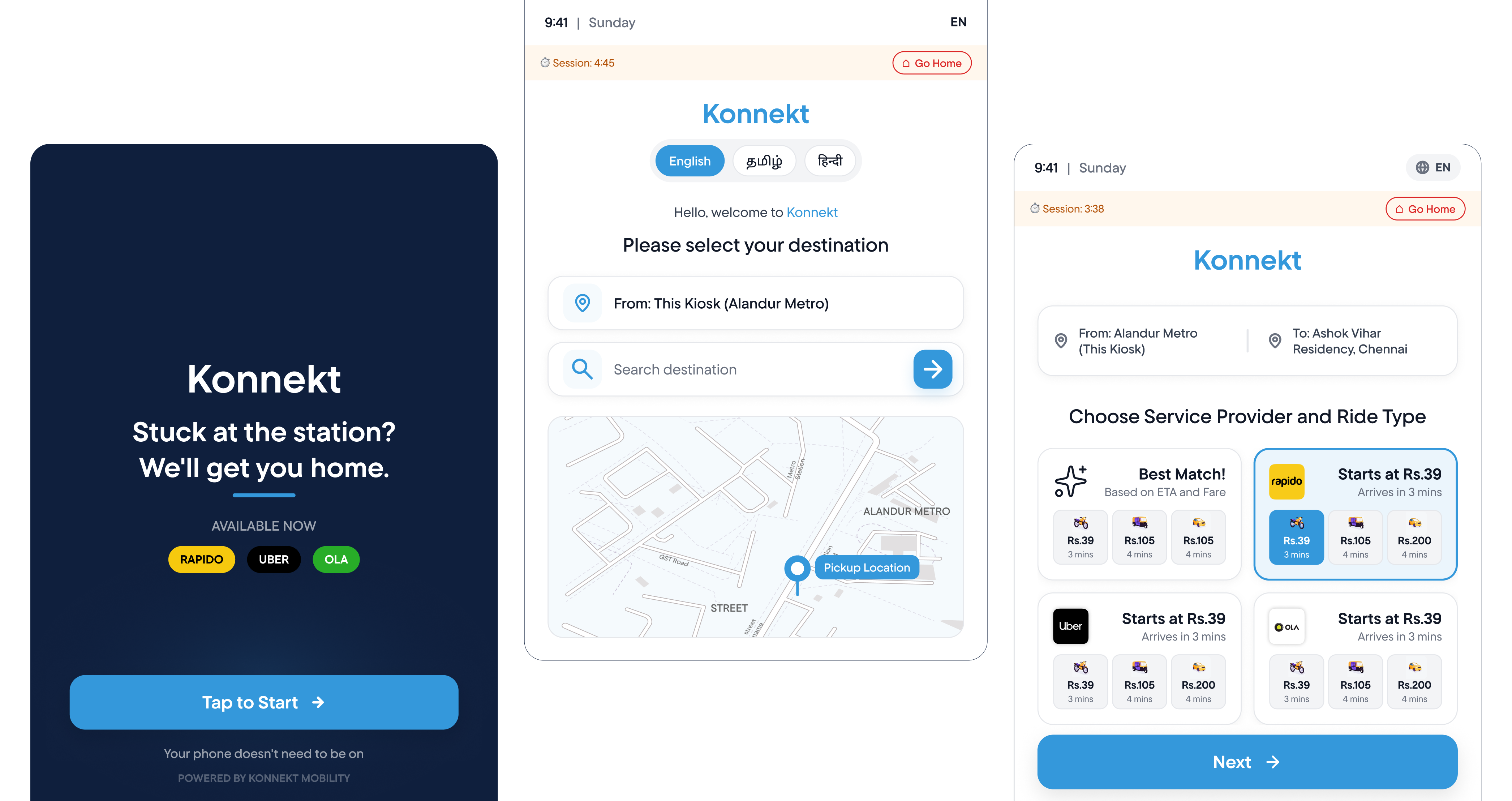
Konnekt is a ride booking kiosk for high-footfall transit areas. A commuter chooses a destination, sees ride types with live fares, picks a provider, pays, and leaves with a printed receipt. Payment uses an RFID card, including the Chennai Metro card they already hold, so no phone, account or data connection is needed.
Principles I held myself to
- Under a minute, start to finish. Someone is waiting behind you and the platform is not a place to linger.
- Price before commitment. The fare is visible before anything is confirmed.
- Verified, not just booked. The ride ends with proof you can show and share.
- Works for everyone in the queue. Large type, high contrast, two languages, no hidden gestures.
6Design decisions
Show the map and the fare together
Early on, destination and price lived on separate screens. People hesitated on the price screen because they could no longer see where they were going. Putting a map with the route beside the ride options let them confirm the place and the cost in one glance.
Offer a safe default
When time is short, choosing between three providers and four ride types is itself a cost. Konnekt pre-selects the option the research favoured (nearest available, fixed fare) so the common case takes one tap, while the others remain one tap away.
Build trust into the receipt
The printed receipt carries the vehicle number, driver name, fare and a code. The commuter can show it to the driver, photograph it, or hand it to someone at home. It is deliberately physical: it works when the phone does not.
Use the card people already trust
Paying with RFID, including the Metro card, removed the need to enter payment details at a public screen, which also removes shoulder-surfing risk.
A kiosk is fixed in place, so it only helps where it is installed. I chose depth at a few busy stops over thin coverage everywhere, because trust is built at the stops people actually use.
7The final flow
From platform to seat, in a few taps.
- Language and destination. Choose Tamil or English, then search for where you're headed or drop a pin on the map.
- Compare ride options. Auto, cab and shared options appear with live fares, estimated arrival and the provider.
- Review the ride. Confirm pickup, destination and total, with the driver and vehicle details shown clearly.
- Pay with your card. Tap an RFID card, including the Chennai Metro card.
- Take your receipt. A printed receipt with vehicle details and a code, ready to show or share.

8What I'd do next
This is a speculative project, so the honest next step is a test.
- Test at a real stop. A cardboard-and-tablet prototype at a station would tell me if the one-minute goal holds with a queue behind the user.
- Measure the safety claim. Do people feel safer with the receipt and verification, or just slower?
- Talk to providers and the transit authority. The design only works if fares and driver data are reliable.
What I'm taking forward: the best design for a hard moment often lives in a different place than the obvious one. Here, the answer was never a better phone app.